Детали задачи
-
 История
-
Решение: Готово
-
 Medium
-
Не заполнено
-
Не заполнено
Описание
Hello colleagues,
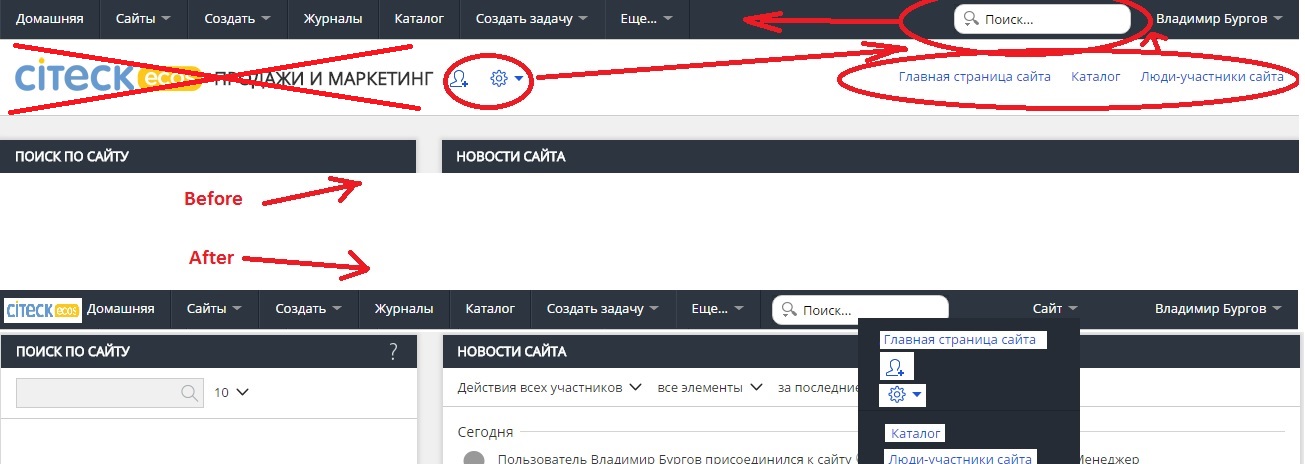
Because the user's initial dashboard should display a maximum of information in a clear view on one page (and without scrolling down), a broad bar at the top of the page between the menus and dashlets, including the company logo and page name ("Home Page ...") takes about 10% of the useful area of the dashboard. This is ineffective when looking at the dashboard to get the necessary information at a glance.
This proposal to modify the user's dashboard - remove the page name strip, and move the company logo to the top of the upper menu line, reducing the scale of the logo (see the picture in the attachment).